
iPhone users are probably familiar with this one: you type in a few words, long-press a word you wish to emphasize, wait for the popup menu to show up, and guess what… the Bold/Italic buttons are not there…
So you quickly tap the |►| button to reveal the next batch of commends, hoping that this time the buttons you need will appear (although not 100% sure) and… damn… the menu disappears altogether.
You missed the tiny |►| button again…

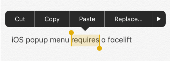
Apple managed to create a challenging popup menu control where half of the content (the buttons) is hidden, and the way to reveal it requires a lot of accuracy and optimism.
WhatsApp’s new popup menu to the rescue
Funny enough, despite using it for few years, I only realized how bad the iOS default popup menu is when WhatsApp introduced a new popup menu that is completely customized.

Using WhatsApp’s new popup menu, I realized how much better it is than the default iOS popup menu created by Apple:
- The verticalized list feels more natural and easy to scan
- Each menu item includes an icon and a text which is great
- Instead of the tiny (and finger unfriendly) |▶︎| button (indicating there are more items) there’s a big “More” menu item which is easier to hit.
- The menu provides a short (but super elegant) haptic feedback which improves the user experience and turns using the menu into an extremely delightful experience.
So now that there’s a much better popup menu around, can Apple borrow the design (which is not innovative in any way, just much friendlier to use) and implement it in its’ next iOS version?
Well, funny enough — a very similar menu control already exists in other iOS UI modules:

So Apple made some bad UI decisions with the text editing popup menu:
- It’s inconsistent with other popup menus (and action sheets etc.) within the iOS platfrom
- It has a few basic usability flaws
Conclusion?
“Apple is doomed! iOS sucks! iPhone is dead!”

No seriously, this is such as small thing, and yet, a UI tool we all use pretty often and can be easily improved. I certainly hope it will be changed sooner than later.